Dear participants and people interested in A.I., unfortunately the event “”Ethics and Communication on the Use of Artificial Intelligence in Companies”” at the Max Planck Institute for Intelligent Systems in Tübingen had to be cancelled for the time being due to the corona virus.
As a small but nice compensation, we recommend a new podcast on the topic of A.I. and communication, which our event partner Storymaker produced together with the speaker Jan Berger, CEO of the think tank 2bAhead.
Together with our partners Storymaker, Kavallerie and Kreissparkasse Tübingen, we are organizing an evening around the topic of ethics and A.I.. Everyone who is concerned with the questions of the future is cordially invited.
THE CRUCIAL QUESTION FOR A.I.
What happens when intelligent systems take over our communication and our decisions? What rules do you follow? A pure logic like the supercomputer HAL in Stanley Kubrick’s sci-fi masterpiece 2001 – A Space Odyssey? Or human ethics? And what do companies today need to know in order to deal ethically with A.I.? These and many other questions will be discussed at the evening event.
Cyber Valley Tübingen/Stuttgart
In Tübingen, two areas of expertise meet: a long tradition of ethics and A.I. experts. Under the term Cyber Valley, researchers from science and industry are pooling their research activities in the field of artificial intelligence. Funded by the state of Baden-Württemberg, the Cyber Valley partners will establish new research groups and chairs in the fields of machine learning, robotics and computer vision.
KEYNOTE SPEECHES:
Dan Jeffries, futurist, thinker and systems architect: “When AI goes wrong and how to fix it fast”
Jan Berger, CEO of 2bAhead ThinkTank: “Corporate Digital Responsibility – just another buzzword?”
ART LECTURE:
HOMO EX DATA – An audiovisual piece about the utopian dimension in the relationship between technology and humans.
When: March 04, 2020 – Admission: 18:00 – Start: 18:30
Where: Max Planck Institute for Intelligent Systems Max-Planck-Ring 4, 7206 Tübingen, Germany
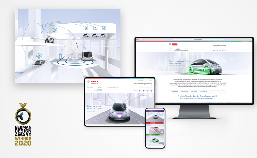
For the communications presence of the Bosch Mobility Solutions division, design hoch drei wins the German Design Award in the Brand Design category. The competition honors innovative projects that are groundbreaking in the German and international design landscape. An international jury of designers and business representatives awards the winners. The German Design Award takes it upon itself to be a competition that advances the design-oriented economy.
For Bosch and design hoch drei, it is yet another award. The communication appearance already received the special award “Best of Best” at the Automotive Brand Contest in September. Now the brand design was also able to convince in a broader competitive environment. It is a confirmation of the good cooperation and the courage to place more emphasis on design quality in the B2B industry.
The communication appearance of Bosch Mobility Solutions convinces with a clear, reduced design language, the futuristic imagery and the consistent communication of benefits.
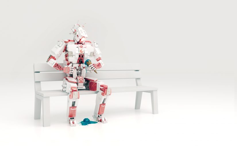
Who do you like more: a person who pushes himself to the fore, comments loudly on everything and never lets you get a word in edgewise OR a person who holds the door open for you, reserves a seat for you wherever you want to sit and always has an open ear for you? Few people will choose the former. Why think any differently about a corporate design?
WHAT IS GOOD DESIGN?
The answer to the question of what good design should be is difficult to give. One definition that most can agree on comes from Dieter Rams. The product designer had a decisive influence on the products of the electrical appliance manufacturer Braun for decades. And in doing so, he provided lasting inspiration for Steve Jobs and Apple. His “rules” are:
Good design is innovative.
Good design makes a product usable.
Good design is aesthetic.
Good design makes a product understandable.
Good design is unobtrusive.
Good design is honest.
Good design is durable.
Good design is consistent down to the last detail.
Good design is environmentally friendly.
Good design is as little design as possible.
Although Rams’ design principles are strongly formulated from his perspective as a product designer, most of the points can also be applied to communication design. And if you want to define good design in just one sentence, you have to say:
GOOD DESIGN IS MODEST.
Take Porsche, for example: Porsche’s corporate design has always stood for clarity and sovereignty. It keeps a low profile and lets the sports cars shine. If you go through the Rams checklist, Porsche’s corporate design fulfills almost all the points. Another example is Google. Here, product and communication design merge: digital services like Google’s search engine are usually product and communication tool in one. The case of Google seems all the more astonishing. The design of the Google homepage is a beacon of modesty. And this despite the fact that it is backed by a complicated algorithm, huge data centers and a billion-dollar corporation. When you visit the homepage, you see a search field, two buttons and the Google logo. That’s it. All the rest is a large white space. You can call it bold or you can call it modest. You get to decide.
A PLACE OF HUMILITY: SILICON VALLEY
Another look across the big ocean shows: Almost all major technology and software corporations in Silicon Valley are discovering modest design for themselves. Apple, as we know, has been a successful pioneer of simple, reduced design for decades (thanks to Dieter Rams). But Apple’s neighbors are not sleeping. The transformation of the tech industry can be seen in its apps. Dropbox, Instagram, Airbnb, Apple Music and Twitter all stand out for their unobtrusiveness. The interface design of the apps is characterized by:
Lots of white space,
black font,
reduced icons,
hardly any color accents.
It is remarkable that they do without strong branding elements. It is even more remarkable that they do so for their most important product or their most important point of contact with the customer. Silicon Valley has recognized that users have now become accustomed to functions and their designs. That’s why app designs are becoming more and more similar. Because in the not-so-young digital world, there are now established functions, fixed locations for functions and learned designs for functions. A test: Where do you expect to find the shopping cart function when shopping online? That’s right, it’s always at the top right. A deviating design would lead to a drastic loss of users. And ultimately to economic damage through fewer sales. Logically designs must be similar, but brands must ultimately be different. How can that be done?
THE WAY OUT OF UNIFORMITY
So where can brands differentiate themselves? How do they manage to stand out from the competition and embody their independence? How does their corporate identity become visible? Basically, the answer is again quite simple: with creative content. More precisely, with texts, images and animations. Good design allows you to focus fully on the content. You can concentrate much more on the message, sharpen it and prepare it creatively. To put it bluntly, content is the new branding. And let’s be honest: content that comes from your own company embodies your own corporate identity much more strongly than some sprawling branding element that repetitively plods through all media, right? When it comes to creative content, we can again praise Google. With the Google Doodles , i.e. the logo gimmicks on certain occasions, Google demonstrates a lot of creativity. The company selects special anniversaries and has them illustrated. This delights users around the globe, and Google uses it to set messages on relevant topics. And since the design of the Google homepage is so reduced, the doodles can be displayed in a wide variety of forms and colors without competing with the design. Nevertheless, everyone recognizes Google as the sender.
Exit strategy from uniformity: creative content is the way out for companies from the always same, interchangeable brand appearances.
IT GETS EASIER
Flexibility and agility are the definitive requirements for corporate designs today. Digital channels demand more adaptability from brands. Their designs need to be more than responsive, they also need to exist in virtual and augmented reality. In addition, brands are losing sovereignty over their design. On social media platforms, providers dictate everything, leaving few design options. The only way to meet all these demands is to reduce the complexity of design. Simple design without many rules, but with flexible principles is the future. In the past, it was rigid templates with concrete measurements; in the future, it will increasingly be design systems that enable creative solutions with free design elements. But the development of “simple” design is not without its difficulties: what looks simple usually involves a lot of work. Because simple design nevertheless fulfills all the functions that a “complicated” one also serves. The designer who develops the “simple” design solves the challenges in advance. With “complicated” design, the problem is left to the user – usually with a less successful end result. And with a lot of effort in creating all the communication tools.
Simple can be harder than complex
Steve Jobs
Another factor that is interesting for companies and especially for marketing: re-branding processes become far less complex and expensive. Simple design is more efficient and sustainable. Adaptations to new media are much more flexible.
tl,dr: Reduced design is a trend (again), but also sustainable. It provides space for creative content and brands can focus more on what they want to communicate to their customers and, most importantly, how.
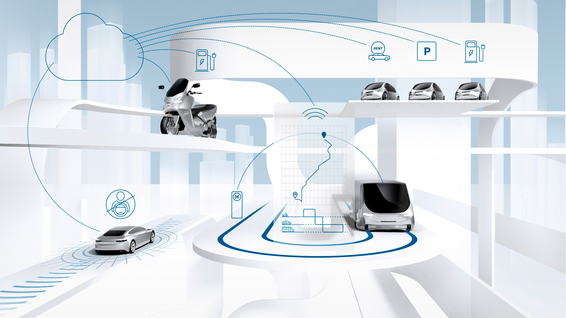
Especially strongly future-oriented technology companies are often faced with the challenge of communicating their complex products in a comprehensible and striking way. This is all the more true as the economy increasingly relies on software and services instead of classic hardware products. Because new, innovative and software-based products in particular are often more difficult to explain than the old familiar toaster, car or toothpaste. Digitally transformed products, platform economies and individual solutions are also changing marketing and press relations. Added to this: More and more decision-makers inform themselves first via digital channels. Their attention is also a scarce commodity on the web that first has to be won. That is why concise and memorable communication is particularly important in online marketing and in the B2B sector. Nothing is more memorable than powerful messages and good visualisations that are consistently geared to the target group.
People can only absorb a limited amount of information. That’s why the simplest arguments are often the strongest. In fact, research suggests that intuitive decisions about complex products often work better based on a few criteria than with a large amount of information and a lot of brainpower. But not everything can be so easily reduced to a few statements or a picture. How can you nevertheless communicate products and services that are difficult to explain in a striking and comprehensible way? By concentrating on the essentials, that is, consciously reducing complexity and filtering a lot of information.
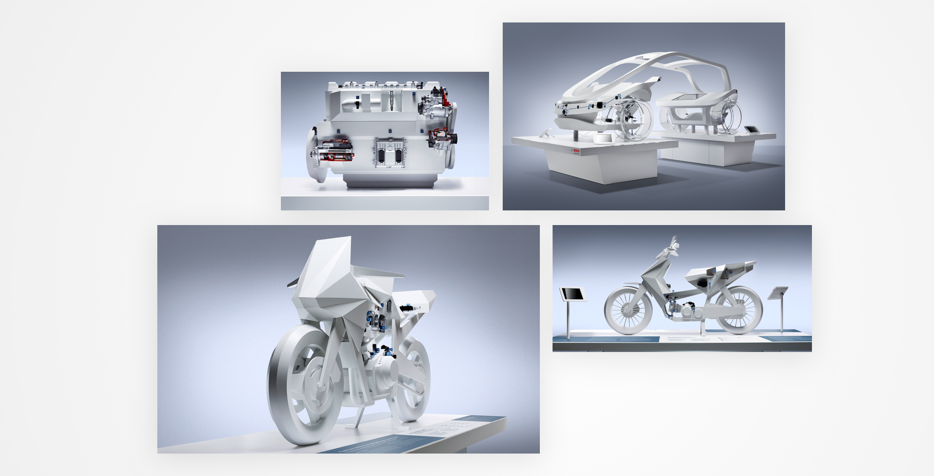
Sculptural exhibits: The systems’ operating and functional principles become visible by leaving out superfluous details.
OUR ANSWER: ELEGANT SIMPLEXITY
Simplify complex content in such a way that it becomes catchy and understandable for the target groups, but no further. It is precisely at this point that the opportunity for successful communication and good design arises, without important information being lost. At design hoch drei, this principle is called Elegant Simplexity. For us, it is the key to explaining abstract solutions and problems. Especially the products and services of technology companies, which often require explanation to outsiders, can be made comprehensible in an elegant way. The principle deliberately sets itself apart from gimmicky advertising and focuses on relevance and benefit for the end customer. It creates an oasis for the eye and invites intensive engagement.
THE CASE: NEW BRAND DESIGN BOSCH MOBILITY SOLUTIONS
The fine art of reduction has been applied by design hoch drei, for example, to the extremely broad and complex technology and service portfolio of Bosch Mobility Solutions, bringing new clarity and fascination to the external image of one of the world’s largest automotive suppliers and providers of mobility solutions. It all began in 2013 with sculptural engine exhibits. These provided an impressive stage for the Bosch components by pushing the abstraction of the unimportant to the white model as far as was just possible and at the same time necessary for easy understanding. Only the Bosch technology itself remained as a tangibly real element.
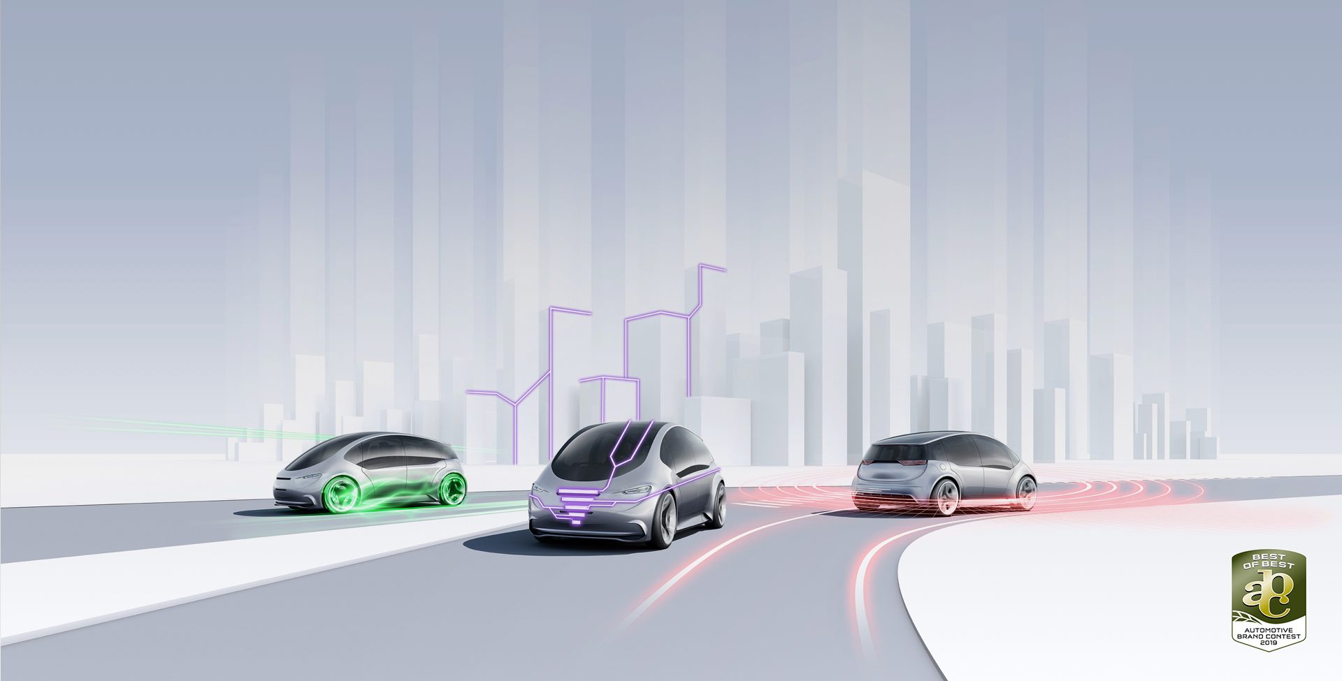
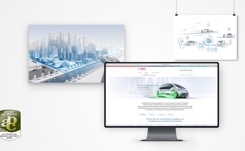
The effect: Bosch technology, which is usually almost invisible but absolutely relevant to the system, was made visible and its complex interplay clear. It was a short leap from engines to entire motorcycle and car sculptures, which, for example, made safety technology or systems for autonomous driving tangible at the booth. The visual principle of the white projection surface for innovative technology was thus proven in the trade show area and was rolled out in all Bosch Mobility Solutions communication media in the following years – from key visuals and numerous print products to moving images, the newly launched web portal, and interactive applications. An approach that led to success: in 2019, Bosch Mobility Solutions’ new brand design was awarded the special Best of Best award of the Automotive Brand Contest.
WHY ELEGANT SIMPLEXITY?
Achieving simple elegance is hard work, but it’s worth it. Because an elegantly designed appearance is more effective, more distinctive and thus more distinguishable from the competition. Simplicity also brings great advantages. Simplified communication is easier for others to connect with, because it is easier to understand than complex information and can therefore be communicated more effectively – both within the company and to the outside world. This does not require elaborate campaigns. Instead, the method of elegance leads to sensible solutions that do not reinvent everything and at the same time create a solid platform for further developments. But how does it all work now?
Complex systems and comprehensible forms of representation
5 STEPS TO ELEGANT SIMPLEXITY
STEP 1: CUT IT INTO PIECES
Everything begins with immersion in the topic at hand. A complex subject should always first be broken down into its individual parts so that it can be understood and then communicated well. If the topic is available in printed form, then one could also cut everything with scissors into (meaningful) small snippets, rearrange them, glue them on and mark discovered connections. The result is comparable to a mind map, only a bit more detailed. No matter what the exact procedure looks like in the end, the same questions always have to be answered. Which elements are there and what are they for? What belongs to what or is related to something else?
STEP 2: SIMPLIFY TO THE CORE
Things become complex by themselves. Making them simple again is the real art. That’s why we leave out everything that is not really important or would be too complex for the attention span of the target group. We always have to ask how much time the user is willing to invest. Depending on the channel, this can be quite different. Online, it often takes just a few seconds to decide whether someone will “stay tuned.” With films, too, the decisive messages should come across within the first 20 to 30 seconds. That’s why, at first, only what belongs to the actual core of a product or topic remains.
STEP 3: REBUILD THE RELEVANT
Now what is really important has to be reassembled. The key here is to find an information structure that correctly reflects the content and at the same time is easy to follow and always remains consistent in itself. Once again, priorities have to be set. What should the user learn and when, what needs to be made clear particularly quickly? What information is a prerequisite for what comes next? What value propositions can we make and how can we prove them with convincing cases? Technical details should be avoided unless the audience consists of experts with a lot of time on their hands, which is unlikely to be the case.
STEP 4: ADD SOME ELEGANCE
Design-oriented communication is more attractive and more memorable. This is also reflected in the fact that design-oriented companies are more successful than their competitors. Design and beauty are therefore not just pretty shells, but a hard-hitting economic factor because they create real value. Used as a strategic tool, they can make brands successful. That’s why, for Elegant Simplexity, we combine good content with elegant design to create an aesthetically functional presence that clearly stands out from the competition and is a pleasure to look at.
STEP 5: Gain Attention
Elegant design and clear messaging are a promising way to attract people to a product, but often more is needed. A product website, no matter how beautifully designed, is useless if no one sees it. An innovative solution at the trade show booth is of little interest if it can only be found in the fine print. In order to attract the desired attention, it is imperative that the staging and advertising are not only tailored to the target group, but also optimally adapted to the channel on which it takes place. However, the following applies across the board: Nothing attracts attention more easily and is better remembered than a good visualization that gets to the heart of a complex topic and at the same time is open for further thoughts and conversations.
tl,dr: Elegant Simplexity is a method that combines design, clear messages and comprehensible visualization of innovations. For Bosch Mobility Solutions, this has resulted in a unique communications presence. This was also confirmed by the “Best of Best” special award presented by the German Design Council at the ABC Awards. Here you can find more details about the communication appearance of Bosch Mobility Solutions.
For the communications presence of Bosch’s Mobility Solutions division, design hoch drei received the prestigious design award in the “Brand Design” category with the special “Best of Best” award. The award was given for the holistic communication presence that we developed and implemented.
WE ARE PLEASED ABOUT THE CONFIRMATION OF OUR WORK BY THE BRAND EXPERTS OF THE ABC JURY
Susanne Wacker, Founder and Managing Partner
We have been working for Bosch Mobility Solutions for around five years, realizing projects for print, digital, moving image and live communication. With 47 billion euros at last count, Mobility Solutions is Bosch’s strongest business sector in terms of sales. In addition to components and systems, the product portfolio increasingly includes software, digital and sharing services.
The Automotive Brand Contest is an international design competition for the automotive industry and is one of the world’s most important industry competitions. The award is presented by the German Design Council. The Council supports the industry in consistently achieving brand added value through design.