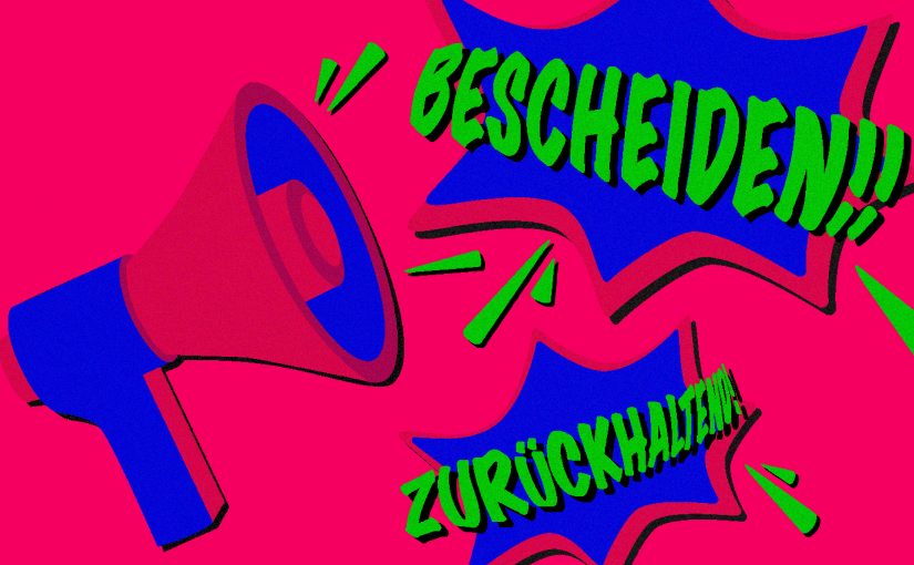
SHORT QUESTION IN ADVANCE
Who do you like more: a person who pushes himself to the fore, comments loudly on everything and never lets you get a word in edgewise OR a person who holds the door open for you, reserves a seat for you wherever you want to sit and always has an open ear for you? Few people will choose the former. Why think any differently about a corporate design?
WHAT IS GOOD DESIGN?
The answer to the question of what good design should be is difficult to give. One definition that most can agree on comes from Dieter Rams. The product designer had a decisive influence on the products of the electrical appliance manufacturer Braun for decades. And in doing so, he provided lasting inspiration for Steve Jobs and Apple. His “rules” are:
- Good design is innovative.
- Good design makes a product usable.
- Good design is aesthetic.
- Good design makes a product understandable.
- Good design is unobtrusive.
- Good design is honest.
- Good design is durable.
- Good design is consistent down to the last detail.
- Good design is environmentally friendly.
- Good design is as little design as possible.
Although Rams’ design principles are strongly formulated from his perspective as a product designer, most of the points can also be applied to communication design. And if you want to define good design in just one sentence, you have to say:
GOOD DESIGN IS MODEST.
Take Porsche, for example: Porsche’s corporate design has always stood for clarity and sovereignty. It keeps a low profile and lets the sports cars shine. If you go through the Rams checklist, Porsche’s corporate design fulfills almost all the points. Another example is Google. Here, product and communication design merge: digital services like Google’s search engine are usually product and communication tool in one. The case of Google seems all the more astonishing. The design of the Google homepage is a beacon of modesty. And this despite the fact that it is backed by a complicated algorithm, huge data centers and a billion-dollar corporation. When you visit the homepage, you see a search field, two buttons and the Google logo. That’s it. All the rest is a large white space. You can call it bold or you can call it modest. You get to decide.
A PLACE OF HUMILITY: SILICON VALLEY
Another look across the big ocean shows: Almost all major technology and software corporations in Silicon Valley are discovering modest design for themselves. Apple, as we know, has been a successful pioneer of simple, reduced design for decades (thanks to Dieter Rams). But Apple’s neighbors are not sleeping. The transformation of the tech industry can be seen in its apps. Dropbox, Instagram, Airbnb, Apple Music and Twitter all stand out for their unobtrusiveness. The interface design of the apps is characterized by:
- Lots of white space,
- black font,
- reduced icons,
- hardly any color accents.
It is remarkable that they do without strong branding elements. It is even more remarkable that they do so for their most important product or their most important point of contact with the customer. Silicon Valley has recognized that users have now become accustomed to functions and their designs. That’s why app designs are becoming more and more similar. Because in the not-so-young digital world, there are now established functions, fixed locations for functions and learned designs for functions. A test: Where do you expect to find the shopping cart function when shopping online? That’s right, it’s always at the top right. A deviating design would lead to a drastic loss of users. And ultimately to economic damage through fewer sales. Logically designs must be similar, but brands must ultimately be different. How can that be done?
THE WAY OUT OF UNIFORMITY
So where can brands differentiate themselves? How do they manage to stand out from the competition and embody their independence? How does their corporate identity become visible? Basically, the answer is again quite simple: with creative content. More precisely, with texts, images and animations. Good design allows you to focus fully on the content. You can concentrate much more on the message, sharpen it and prepare it creatively. To put it bluntly, content is the new branding. And let’s be honest: content that comes from your own company embodies your own corporate identity much more strongly than some sprawling branding element that repetitively plods through all media, right? When it comes to creative content, we can again praise Google. With the Google Doodles , i.e. the logo gimmicks on certain occasions, Google demonstrates a lot of creativity. The company selects special anniversaries and has them illustrated. This delights users around the globe, and Google uses it to set messages on relevant topics. And since the design of the Google homepage is so reduced, the doodles can be displayed in a wide variety of forms and colors without competing with the design. Nevertheless, everyone recognizes Google as the sender.
IT GETS EASIER
Flexibility and agility are the definitive requirements for corporate designs today. Digital channels demand more adaptability from brands. Their designs need to be more than responsive, they also need to exist in virtual and augmented reality. In addition, brands are losing sovereignty over their design. On social media platforms, providers dictate everything, leaving few design options. The only way to meet all these demands is to reduce the complexity of design. Simple design without many rules, but with flexible principles is the future. In the past, it was rigid templates with concrete measurements; in the future, it will increasingly be design systems that enable creative solutions with free design elements. But the development of “simple” design is not without its difficulties: what looks simple usually involves a lot of work. Because simple design nevertheless fulfills all the functions that a “complicated” one also serves. The designer who develops the “simple” design solves the challenges in advance. With “complicated” design, the problem is left to the user – usually with a less successful end result. And with a lot of effort in creating all the communication tools.
Simple can be harder than complex
Steve Jobs
Another factor that is interesting for companies and especially for marketing: re-branding processes become far less complex and expensive. Simple design is more efficient and sustainable. Adaptations to new media are much more flexible.
tl,dr: Reduced design is a trend (again), but also sustainable. It provides space for creative content and brands can focus more on what they want to communicate to their customers and, most importantly, how.